Thursday, 13 February 2014

comics / garffiti

COLOUR: colour in Comics/Graffiti style design vaerys alot depending on the artist it can rang from full black and white to a full range of colours on one piece of work. however weither it is black and white or full colour it is always contrasting and this makes comics/graffiti so effective.                    
                                   (Frank Miller)            
                                                                                                                                                                                                                                   (Mike Giant)      
MAIN IMAGE: the Main Image for Comics and graffiti depends on the artist it could be photographs or inked drawings or cartoons or a mixture of both. either of these styles vairy in colour aswell from highly contrasting black and whites or very bright colourful graffiti pieces.

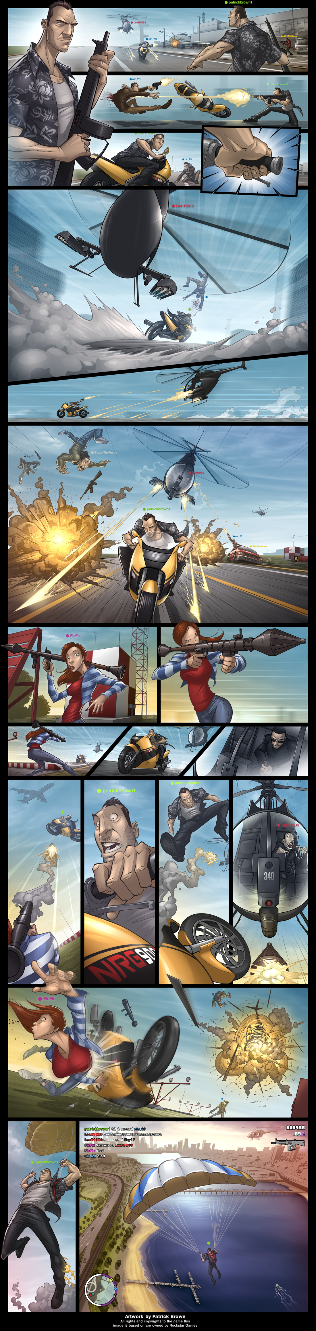
LAYOUT: comics is a form of telling a story. sometimes without any dialoge at all but they always try to achieve that as clearly as possible. Graffiti conserntrates mostly on the main image and making it stand out as much as possible.                                                                                                             (Patric Brown)

COMPOSITION: graffiti is all about the main image or text. the art is placed in the middle of the page. comics are stories and are set out in panals these change shape and size depending on whats happening in the story at the time.


(Misery)

TEXT/TYPE: Comic text is useally very clear and very simple to understand. graffiti is different the text can often be the main image its quite similer to typography. graffiti text isnt easy or clear to read and is useally very brightly coloured.

SPACE: Graffiti has no space restrictions it can be as large or as small as it wants. weither as comics have restriction to the pannals and the page size.


               (Misery)

typography

(David Carson)


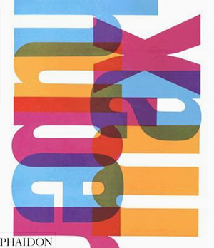
COLOUR: Colour is a very important part of Typography type design it seems that almost every possible colour can be used on one design and is sometimes overpowering to the eye.

SPACE: the space in typography is most often very cramed everything is tightly squeezed onto the page with no or very little room for anything else.

              (neville brody)                                                                            (hurb lubalin)                  

MAIN IMAGE: in Typography there isnt really a 'Main Image' inplace of that there are large scale letters or works that substute for a main image.

LAYOUT: for typography the layout used to create alot of contrast with much empty space behind the cramed text.

TEXT/TYPE: the text in typography is the key part to this style of design it replaces the main image completely and is araged in a way that catches the eye.

      (max huber)                                                                                       (hurb lubalin)


Wednesday, 12 February 2014

early to mid 20th century

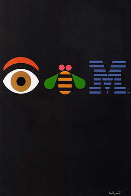
COLOUR:  The colour used in early to mid 20th century art is very vivid and with the emotional style of brushwork it emphasized form and color over recongizable or representation of a subject.mixture of very bright and very dull colours.
(Paul Rand)
MAIN IMAGE: many main images. very easy to see and clear. dominating main image.

SPACE: main imagaie most often placed in the centre with plenty of space surrounding which made it easy to concertrate on the main image.


INFLUENCES:  most of the early to mid 20th century design was inspired by
Large corprate companys that needed logos.
                                                             (Jan Tschichold)


COMPOSITION: The main image is most often placed in the center with
a one colour background surrounding it to make the main image stand out.

TEXT/TYPE: text is placed either on top or under neath the main image and is very clear to read.
        
         (Tom Eckersley)

(A M Cassandre)


Tuesday, 4 February 2014

HaydenDesign300-url-links

http://iv1.lisimg.com/image/1618363/600full-herbert-bayer.jpg
http://essediem.files.wordpress.com/2010/09/bantockmain.jpg
http://blog.jeromyj.com/wp-content/uploads/2009/11/joseph-muller-brockman-olma-cow-poster.jpg
http://25.media.tumblr.com/806e0f5dc411bb27272bc2658cf71644/tumblr_muqaoraGox1qcg3zwo1_1280.jpg
http://www.reasonwhy.es/sites/default/files/oscar-marine-ReasonWhy.es_.png
http://bigotherbigother.files.wordpress.com/2011/08/comic-book-legal-defense-fund-ad2.jpg
http://pioneersofnow.wacom.com/sites/all/themes/sky/original/PON_Jon_gallery_2.jpg
http://img.aasd.com.au/61316441.jpg
https://blogger.googleusercontent.com/img/b/R29vZ2xl/AVvXsEiQD6xezWzYHzo8Fzvl8IXYFwyBSkaESiBfvbW9TzlnUx6ngenbfDrfe3-O7EDc5e1OII3IVywftYJrB4EppuqLVCLV8ao2trMjQ3MUAkH3g9TpX57P3oOhHd9jB47nYLdD35IOMRw_t68Z/s1600/Neville+Brody.jpg

Design300-3.1

this is my first design blog