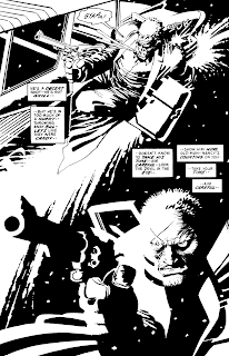
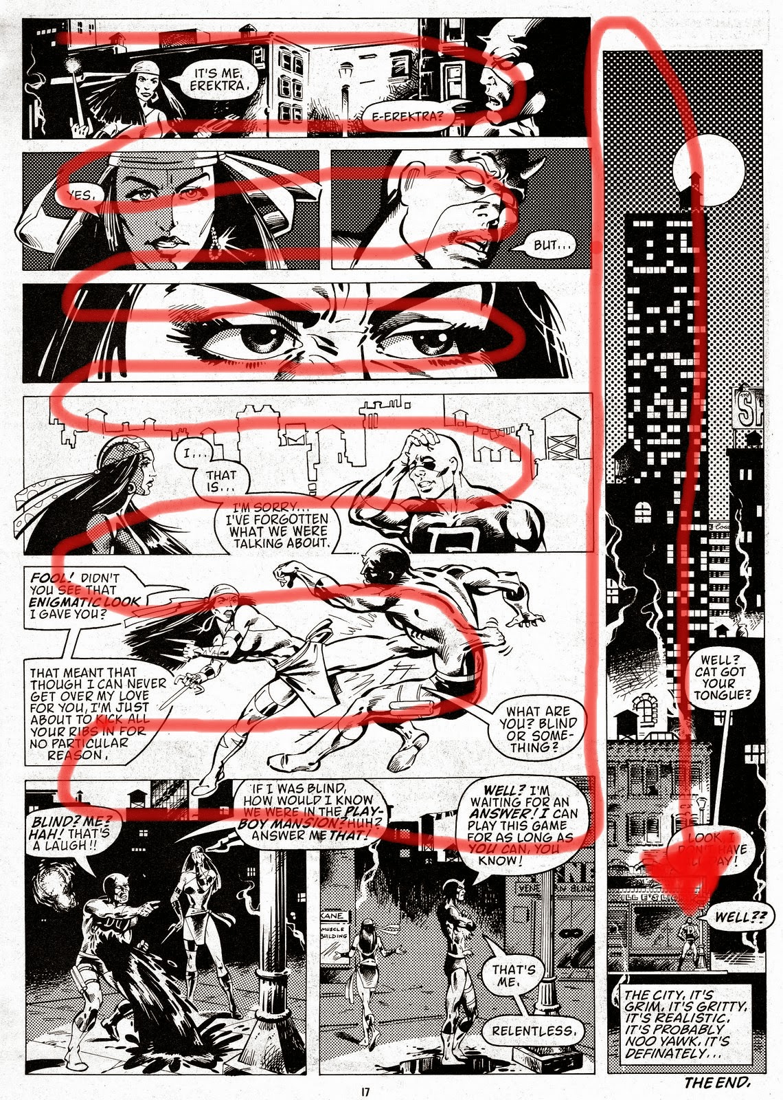
 Frank Miller is an American writer, artist, and film director best known for his dark comic book stories and graphic novels such as Ronin, Daredevil: Born Again, The Dark Knight Returns, Sin City and 300.
Books: Born Again, Holy Terror, Batman: The Dark Knight Returns, more
movie: Sin City: A Dame to Kill For
TV shows: HypaSpacemovie: Sin City: A Dame to Kill For
INFLUENCES:
FM: Well, yeah. Just about everything I can get my hands on. As far as training goes, one unofficial teacher of mine was the artist Neal Adams, who put up with me when I kept showing up at his studio. He would do tissue overlays to show me how to compose a page better, and generally tell me to give up and go home. But I kept coming back until I was able to get some work." (taken from an interview between Frank Miller and A.V club)
COLOUR:
Frank Miller is not very well known for using colour. Except for Black, white, and sometimes red. he doesn't use any shading or toning however he does use some cross hatching witch creates the illusion of tone/shading. apart from this Frank Miller uses black ink on white background. this makes his art look like a photograph with very high threshold even though all of his works are completely hand drawn. this is a very strong contrasting effect and when a splash or red such as blood is added it becomes very visally appealing. 
"O: Is there any metaphorical significance to the unusual black-and-white art, with no gray tones?
"O: The black-and-white art does tend to suggest a moral simplicity that's echoed in the heroic scale of your characters—the epic, larger-than-life bad guys, particularly.
FM: The larger-than-life thing is definitely what I'm after. I've always drawn dark stories. Occasionally, I'll try a perfect hero, but it's a real stretch for me. I like 'em warts and all, and obsessive and weird. No wonder the superhero I'm most associated with dresses up like a bat."

Text is obviously a very important part of comics and Frank Millers work however it is still a very simple part of it the only text in his work is dialogue of the charctures talking in the panels the font and size is often not very lage and most importantly very clear and easy to read. text/dialogue is presented in a speech bubble to the sides of the page so that they cover minimul space and don't cover important parts or expressions/events that's are happening in the panel.
SPACE: Frank miller pushes his pictures to the very edges of the panels often only showing the very most important parts of what needs to be shown at the time of the story. the panels cover the whole of the page however the number of panels can change from just one two paged image to one page completely fill of small panels.
No comments:
Post a Comment