FRANK MILLER
ART CHANTRY
Monday, 31 March 2014
Monday, 24 March 2014
Egon Schiele
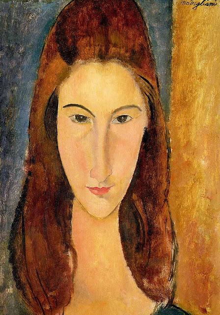
 Amedeo Clemente Modigliani was born on 12 July1884 in the Italian Mediterranean port of Livorno. in january 1906 Modigliani left for paris determined to chance his luck as a portrait painter. He enthusiastically adopted a similar bohemian lifestyle to that he had sampled in the old quarters of venice. he used stimulants, mostly Hashish and alchol maybe in an attempt to overcome his characteristic shyness. during his early years in Paris he affected an artistic style of dress. Distressed by the contuinal financial hardships Modiglian began to deteriorate he was expelled from dr alexandres artists comunity for destroying other members work.
A memorial exhibition of cezannes work was held in 1907 and soon Modigliani was imitating Cezannes way of suggesting form and space through colour.
he apears to have lived in conditions of extream povertyvsoon after his arrival in paris. he found cheap lodgings in montparnasse. his allowence from home was to little to afford art materials. he turned to sclupture, he would reputedly steal sleepers from the new mexico metro line nearby for wood to carve and many of the Caryatids were crafted by stone blocks removed from construction sites at night.
Despite his limited subject matter of portraits and nudes Modiglianis work was unique in its combination of traditional form with new painting techniques.
 Portriats and nudes established themselves as Modiglianis subjects from the begining (he painted only a few landscapes) he was not concerned with portraying realistic apperances but expressing the feeling and mood of his models especially in relation to himself. most often in the early part of his career tension and anxiety were the recurring motifs probably echoing those features in his own life at the time. Living as a poverty stricken foreigner in Paris brought its own insecurities compounded by his feeling of alienation from the avant grade artists his lack of money meant shortage of materials so his paint was spread thinly and he had to use both sides of the canvas. Nonetheless Certian characteristics emerge as trademarks of his style as early 1908 fixing his own personal identity as an artist. and these are refinded into the elegance and poise of his last pictures in his portraits sloping shoulders and slender necks support gently tilting heads in which small eyes are caught in a hypnotic expression.
From Itality modigliani carried with him the influences of symbolism and stile liberty and his early works reflect this in mood and in their linear pattern. but in Paris Modigliani discovered Cezanne at his retrospective exhibition in 1907 and his debt to Cezanne is revealed in the construction of his compositions in the arrangment of forms and isolation of planes through colour as well as his choppy brushstrokes although Cezanne had opened a new direction in art leading to cubism he had never lost respect for the integrity of the human form which became central for modigliani.
when attempting a realistic image an artist uses colour in a natural way and tries to portray exactly what he sees in a stylized image however colour is used to emphasize a particular point.
Modigliani relied on a linear graphic style influenced by his early enthusiasm for art nouveau and used elogation to enhance the expressive quality of his line his long faces too reflect the african masks newly discovered by the art world. but Modigliani used the device of elongation to convey many different qualities of character from arrogance to grace depending on how he saw his sitter.

Saturday, 22 March 2014
TASK 4 Designer analyse
KEN ADAMS
was born and raised in Northern Delaware where he has lived and drawn most of his life. he is a freelance graphic designer and illustrator under the name 'K3N' he is best known for his extensive work with the grammy nominated heavy metal band 'Lamb of God' though he has worked with hundreds of companys, organizations and bands over his career.
Ken has been a freelance designer for over 15 years he has created logos illustrations merchandise advertising packaging and print pieces for companies and individuals. he is also very skilled and experienced in screenprinting.
INFLUENCES: Ken Adams has alot of influences but some of his biggest have been: 50s and 60s "rubber monster" movies, the Simpsons, Pushead, Salvador Dali, Dr. Seuss, Derek Riggs (iron maiden cover artist), Hieronyms Bosch, Tim Burton, Edward Gorey, National Geographic, Starblazers, Soviet Iconography, skateboard art of the 80s, Jim henson / the dark Crystal, George Lucas and the first three Starwars movies, classic mMarvel and DC Superhero comics, H.R Giger / Aliens, Area 51, Punk Rock flyer art, the Millenium Falcon, and The Brains that wouldnt Die.
COMPOSITION: Ken Adams is a free lance designer so his work depends on the progect. however Adams does a lot of work for metal bands such as Lamb of God Kens work reflects the comic style of design his main images are always hand drawn. and are done in a with a lot of thin lines this gives a comic or almost detailed cartoon look a good example of this is on the 'Burn the Priest' album below. he uses a wide range of colour schemes mostly not very contrasting but more matching. the Suicide Silence album 'The Black Crown' is a good example of Adams using a contrasting colour the albums main image and background colours are a mixture of dark and light greys but the title is warm yellow this makes the album look very appealing and is one of my favourite album covers.
COLOURS: Adams is strategic with his colour schemes he places them in a way that gides the eye really nicely for example the album below the yellow of the of the title on they left side flows across to the fire in the nuns hand and then across further to the fire surrounding the priest and then back again. this means that your eye moves across the album cover in a really straight clear direction allowing you to clearly see everything that's going on with out confusing you. the 'Wrath' album is really nice because your eye is drawn imediatly to the centre of the page with the logo placed vertically in the middle of the page. although simple its still really effective.
MAIN IMAGE: all of Adams main images are hand drawn and then edited and coloured on the computer the position of the image depends on what the client wants so every piece of his work looks different. his main images are drawn with simple thin black lines and then simply coloured on the inside this gives his main images a really comic/cartoon style of design. this is one of the few similarities between most of his works.
TEXT/TYPE: Ken Adams is very minimal with text and type since he is mostly a illustrator and since he mainly designs albums not a lot of text is needed Ken will only use the name of the band and the name of the album on his covers and sometimes not even the band name. but when the band name is used its always the band font or logo, something that is put on all of the bands merchandise its something that people will remember and reconise.


(LAMB OF GOD - WRATH ALBUM)

(SUICIDE SILENCE - THE BLACK CROWN ALBUM)

(PINSTRUCK TATTOOS - WEBSITE)


was born and raised in Northern Delaware where he has lived and drawn most of his life. he is a freelance graphic designer and illustrator under the name 'K3N' he is best known for his extensive work with the grammy nominated heavy metal band 'Lamb of God' though he has worked with hundreds of companys, organizations and bands over his career.
Ken has been a freelance designer for over 15 years he has created logos illustrations merchandise advertising packaging and print pieces for companies and individuals. he is also very skilled and experienced in screenprinting.
INFLUENCES: Ken Adams has alot of influences but some of his biggest have been: 50s and 60s "rubber monster" movies, the Simpsons, Pushead, Salvador Dali, Dr. Seuss, Derek Riggs (iron maiden cover artist), Hieronyms Bosch, Tim Burton, Edward Gorey, National Geographic, Starblazers, Soviet Iconography, skateboard art of the 80s, Jim henson / the dark Crystal, George Lucas and the first three Starwars movies, classic mMarvel and DC Superhero comics, H.R Giger / Aliens, Area 51, Punk Rock flyer art, the Millenium Falcon, and The Brains that wouldnt Die.
COMPOSITION: Ken Adams is a free lance designer so his work depends on the progect. however Adams does a lot of work for metal bands such as Lamb of God Kens work reflects the comic style of design his main images are always hand drawn. and are done in a with a lot of thin lines this gives a comic or almost detailed cartoon look a good example of this is on the 'Burn the Priest' album below. he uses a wide range of colour schemes mostly not very contrasting but more matching. the Suicide Silence album 'The Black Crown' is a good example of Adams using a contrasting colour the albums main image and background colours are a mixture of dark and light greys but the title is warm yellow this makes the album look very appealing and is one of my favourite album covers.
COLOURS: Adams is strategic with his colour schemes he places them in a way that gides the eye really nicely for example the album below the yellow of the of the title on they left side flows across to the fire in the nuns hand and then across further to the fire surrounding the priest and then back again. this means that your eye moves across the album cover in a really straight clear direction allowing you to clearly see everything that's going on with out confusing you. the 'Wrath' album is really nice because your eye is drawn imediatly to the centre of the page with the logo placed vertically in the middle of the page. although simple its still really effective.
MAIN IMAGE: all of Adams main images are hand drawn and then edited and coloured on the computer the position of the image depends on what the client wants so every piece of his work looks different. his main images are drawn with simple thin black lines and then simply coloured on the inside this gives his main images a really comic/cartoon style of design. this is one of the few similarities between most of his works.
TEXT/TYPE: Ken Adams is very minimal with text and type since he is mostly a illustrator and since he mainly designs albums not a lot of text is needed Ken will only use the name of the band and the name of the album on his covers and sometimes not even the band name. but when the band name is used its always the band font or logo, something that is put on all of the bands merchandise its something that people will remember and reconise.
(LAMB OF GOD - WRATH ALBUM)
(SUICIDE SILENCE - THE BLACK CROWN ALBUM)
(PINSTRUCK TATTOOS - WEBSITE)
Thursday, 20 March 2014
TASK 3 Compare
comics / garffiti
COLOUR: colour in Comics/Graffiti style design vaerys alot depending on the artist it can rang from full black and white to a full range of colours on one piece of work. however weither it is black and white or full colour it is always contrasting and this makes comics/graffiti so effective.
(FRANK MILLER)
(FRANK MILLER)
 MAIN IMAGE: the Main Image for Comics and graffiti depends on the artist it could be photographs or inked drawings or cartoons or a mixture of both. either of these styles vairy in colour aswell from highly contrasting black and whites or very bright colourful graffiti pieces.
LAYOUT: comics is a form of telling a story. sometimes without any dialoge at all but they always try to achieve that as clearly as possible. Graffiti conserntrates mostly on the main image and making it stand out as much as possible.
COMPOSITION: graffiti is all about the main image or text. the art is placed in the middle of the page. comics are stories and are set out in panals these change shape and size depending on whats happening in the story at the time.
(BANSKY)
(BANSKY)

TEXT/TYPE: Comic text is useally very clear and very simple to understand. graffiti is different the text can often be the main image its quite similer to typography. graffiti text isnt easy or clear to read and is useally very brightly coloured.
SPACE: Graffiti has no space restrictions it can be as large or as small as it wants. weither as comics have restriction to the pannals and the page size.
illustration
(ART CHANTRY)
 COLOUR: most of modern illustration uses simple black and white images or very bright highly saturated colours.
MAIN IMAGE: the point of illustartion is 'Mainimage' so the mian image is very simple and domiant in the centre of the page.
SPACE: illustration puts the main image in the centre of the page useally with a one colour or white background. the backgroung colour helps the main image stand out and keeps it from touching the edges.
LAYOUT: in the design style Illustration the main image is the center of attention and is placed in the middle of the page creating a strong point of focus.

COMPOSITION: composition in design makes a very clear and ballanced relationship between the main image and the background making it a strong form of art.
LAYOUT: in the design style Illustration the main image is the center of attention and is placed in the middle of the page creating a strong point of focus.
COMPOSITION: composition in design makes a very clear and ballanced relationship between the main image and the background making it a strong form of art.
TEXT/TYPE: text is very rearly used in illustration. but when it is its clear and easy to read but standing alone and not really part of the image. text can be used to help get the point across.
SIMIALIES:
COLOUR: Both Illustration and comics use simple colours with not a lot of texture and shading but has heaps of contrast that looks appealing.
MAIN IMAGE: For both styles of design the main image is very important. alot of main images are of people. mostly protraits.
SPACE: gerreally both design styles use up all of the available space there isnt alot of negative space.
COMPOSITION: Both styles of design are (depending on the artist) hand made they use simple, clear, contrasting colours. the product is often messy there is alot going on visually in these pieces but with the hight contrast colours it isnt to messy to see or understand.
TEXT/TYPE: text isnt so mportant in either styles but they are used to help get a point across or explain something. apart from that the only other form of txt is titles for the product.
Thursday, 13 March 2014
ART CHANTRY

Graphic Designer
Born: April 9, 1954 (age 59), Seattle, Washington, United States
Education: Western Washington University
INFLUENCES:
Among his influences are many forms of "outsider art," such as monster magazines, hot-rod art, and psychedelic culture. He found much inspiration for innovative graphic ideas in an article on Polish posters.
Chantry's sense of design relates to the punk scene in Seattle as he finds himself, with the avant-garde, creating posters for local rock concerts. Chantry has championed what he considers to be the "subculture" of design, a neglected commercial usage of the industrial trade seen in the tool catalogs of the 1940s and 50s.
http://americanart.si.edu/search/artist_bio.cfm?ID=7244COLOUR:
 Art Chantry use of colour is quite unique compared to other designers. he mainly sticks to using warm flat colours in his pieces often sticking to just one or two colours with grey/black and white. he also sometimes uses dots over his images to create the illusion of tone or texture. much like the way that Frank Miller uses cross hitching in his works. this gives his designs a comic style effect as well.
MAIN IMAGE:
Art Chantry uses alot of photos and hand drawn comic style characters. his photos are often coloursied in a colour that contrasts strongly with the background colour. this contributes alot to his punk style of design.
TEXT/TYPE:
Art Chantry uses alot of typography in his design work. his punk style is very effective. i really like the way that his words look like each letter has been cut out of news papers. the way that he places his text isnt very clear and hard to describe since it changes in each work. however Arts text often overlaps the main image, is cut into smaller segmants and go be pointed in a varity of directions.
COMPOSITION:
Art Chantry mainly uses hand drawn pieces of art or black and white photos. his style is much like punk flyers his designs are quite flat and 2D the colours he uses are a mixture of cool and warm often on the same page. he doesnt leave much negative space behind his main images and he always uses as much of the space as possible. I think that it is fair to say that Art Chantry creates very quite angry images. Art Chantrys work is often labled as 'Punk' this is proven by the way he creates his work and the type he creates firstly he is the artist of many many band posters and also all of his art is handmade which is a very punk thing. in this interview he talks about his 'angry images' and is asked whats pissing him off so much.
L: You've created thousands of mostly ANGRY images for us to behold and I know you're aware of that, so my question is: What is pissing you off?
A: What pisses me off? Well,you,for starters(laughing). What pisses me off (reflective), well, I had a misspent youth that left me feeling betrayed and forlorn. Forlorn is a good word. Spell that right,would you? I don't know, maybe it was because I grew up poor. I mean isn't that your excuse?
L: I guess.A: I mean, I grew up REALLY poor. We were so poor that people on welfare used to give us their extra food. We lived in a house that was once a chicken coop.
L: Are you saying you were raised in a chicken coop?
A: No, it used to be a chicken coop. I actually started off in a really wealthy family. My dad was actually a Harvard lawyer...
All of Art Chantry's is made by hand. he really does not like working on computers as he explains here in another snippet of this interview.
L: You are not into computers. Why is that?
A: Because I prefer to work with my hands. I like what I do. If I had to sit in front of a screen all day I'd go nuts. I like to move around little pieces of paper and I also don't understand technology very well. For instance, I don't understand how push-button phones work. I use a rotary-dial around the office.
(and another snippet from an interview..)
Chantry- and because everybody has got a computer now, and everybody can buy a design disk, prices are dropping and we have to buy $20,000 worth of equipment just to maintain the lowest level of competency, and at the same time we're expected to take on all these additional skills at no extra charge. I mean, how long are we gonna put up with this shit? That's ridiculous. That's just absurd. But everybody in the design industry just embraces it as "it's progress, it's wonderful," but it's not when you think about it, we're just getting screwed.
Art Chantrys punk style of design is very effective and eye catching. he uses alot of black and white photos as his main image ontop of a bright single coloured background surrounded by typorgaphy.

Wednesday, 12 March 2014
Frank MIller

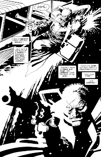 Frank Miller is an American writer, artist, and film director best known for his dark comic book stories and graphic novels such as Ronin, Daredevil: Born Again, The Dark Knight Returns, Sin City and 300.
Books: Born Again, Holy Terror, Batman: The Dark Knight Returns, more
movie: Sin City: A Dame to Kill For
TV shows: HypaSpacemovie: Sin City: A Dame to Kill For
INFLUENCES:
FM: Well, yeah. Just about everything I can get my hands on. As far as training goes, one unofficial teacher of mine was the artist Neal Adams, who put up with me when I kept showing up at his studio. He would do tissue overlays to show me how to compose a page better, and generally tell me to give up and go home. But I kept coming back until I was able to get some work." (taken from an interview between Frank Miller and A.V club)
COLOUR:
Frank Miller is not very well known for using colour. Except for Black, white, and sometimes red. he doesn't use any shading or toning however he does use some cross hatching witch creates the illusion of tone/shading. apart from this Frank Miller uses black ink on white background. this makes his art look like a photograph with very high threshold even though all of his works are completely hand drawn. this is a very strong contrasting effect and when a splash or red such as blood is added it becomes very visally appealing. 
"O: Is there any metaphorical significance to the unusual black-and-white art, with no gray tones?
FM: Actually, it was because Lynn Varley really didn't feel like coloring comics at the time. But also, I wanted to see if I could actually do the whole book myself. That's also why I lettered it. And it fits the genre so well. In a way, Sin City's designed to be paced somewhere between an American comic book and Japanese manga. Working in black and white, I realized that the eye is less patient, and you have to make your point, and sometimes repeat it. Slowing things down is harder in black and white, because there isn't as much for the eye to enjoy. A lot of my job is slowing you down. That's really a lot of what goes into a comic book. Finding ways to charm or amuse the eye in ways that make you linger. Because unlike in a film, I have no control over your eye. Technically, you could read my work in seconds, and I want you to take minutes." "O: The black-and-white art does tend to suggest a moral simplicity that's echoed in the heroic scale of your characters—the epic, larger-than-life bad guys, particularly.
FM: The larger-than-life thing is definitely what I'm after. I've always drawn dark stories. Occasionally, I'll try a perfect hero, but it's a real stretch for me. I like 'em warts and all, and obsessive and weird. No wonder the superhero I'm most associated with dresses up like a bat."


Text is obviously a very important part of comics and Frank Millers work however it is still a very simple part of it the only text in his work is dialogue of the charctures talking in the panels the font and size is often not very lage and most importantly very clear and easy to read. text/dialogue is presented in a speech bubble to the sides of the page so that they cover minimul space and don't cover important parts or expressions/events that's are happening in the panel.

SPACE: Frank miller pushes his pictures to the very edges of the panels often only showing the very most important parts of what needs to be shown at the time of the story. the panels cover the whole of the page however the number of panels can change from just one two paged image to one page completely fill of small panels.
Subscribe to:
Posts (Atom)